🔴The Problem with Box Subscriptions
👎🏼Hyper-Specialized, Boring, & Wasteful
Existing box subscription brands are often based on a certain theme or product category, which has led to the market being saturated with many competitors.
Additionally, they fail to provide true value to their customers. Sure, sending them items related to their hobbies is fun, but are they really helping them in any way?
In a world constantly at risk of climate change and pollution, it has become crucial to think about the waste we generate, and how it's managed.
Unfortunately, most brands in this space lack any sort of recycling or repurposing features, promoting negative business practices.
Unfortunately, most brands in this space lack any sort of recycling or repurposing features, promoting negative business practices.
🟢HobbyHarbor's Solution
👍🏼Customizable, Aids Learning, and Promotes Product Reuse
HobbyHarbor flips the model by allowing the customer to choose their own categories.
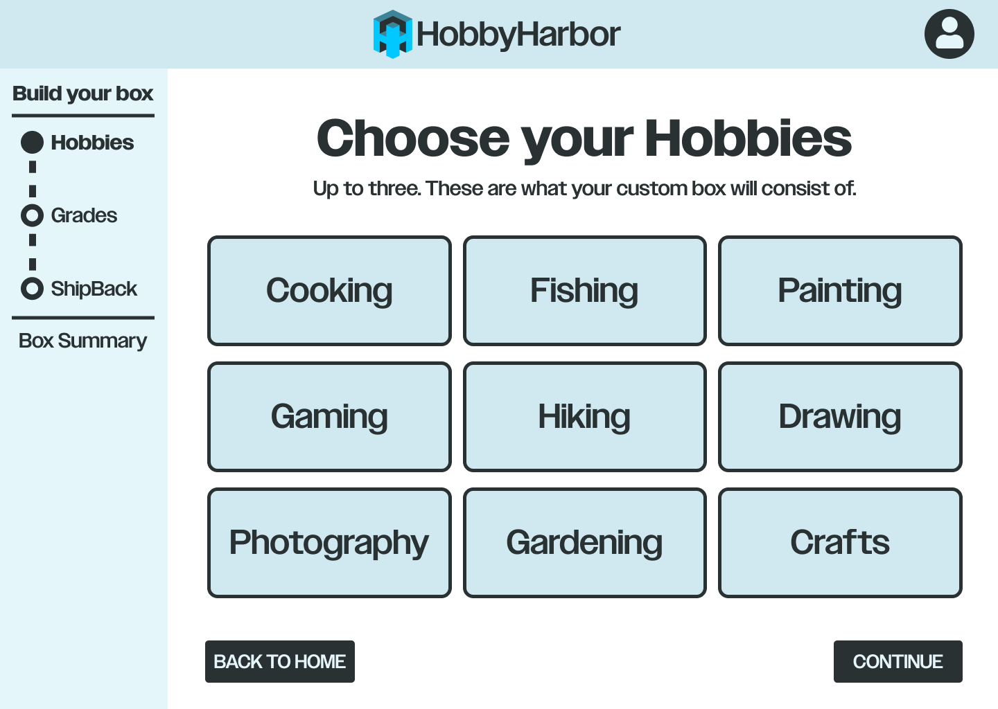
By allowing them to choose up to three, they can reap the benefits of three “traditional box subscriptions,” all in one order.
By allowing them to choose up to three, they can reap the benefits of three “traditional box subscriptions,” all in one order.
Instead of sending random trinkets, HobbyHarbor actually supports learning.
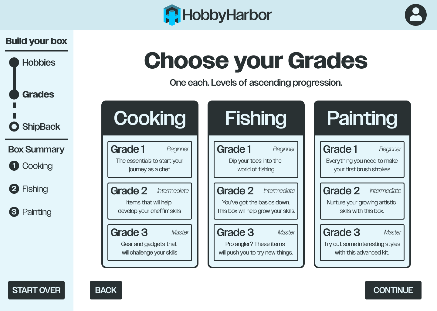
Simply pick your existing level of skill, and the box's contents will reflect it while supporting you improve and learn new things.
Simply pick your existing level of skill, and the box's contents will reflect it while supporting you improve and learn new things.
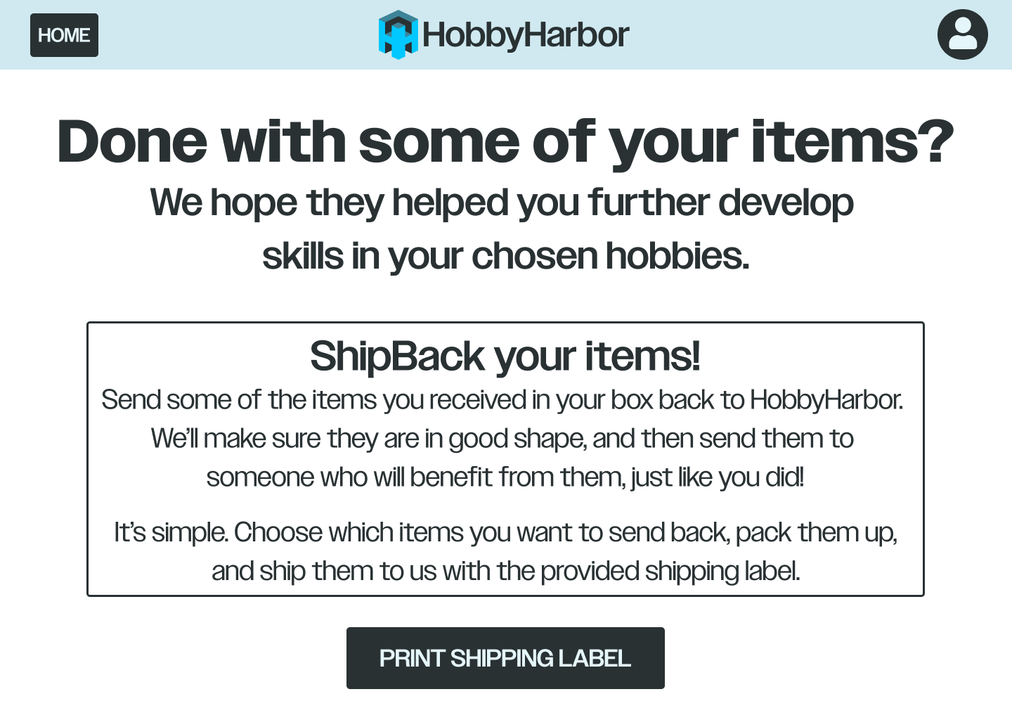
Finally, when a user has finished using items from their box to learn, they can optionally ship them back.
They will then be sent to another user to help them do the same. This reduces waste, promotes reuse, and helps create a community!
They will then be sent to another user to help them do the same. This reduces waste, promotes reuse, and helps create a community!
🎨Brand Design
Logo Design
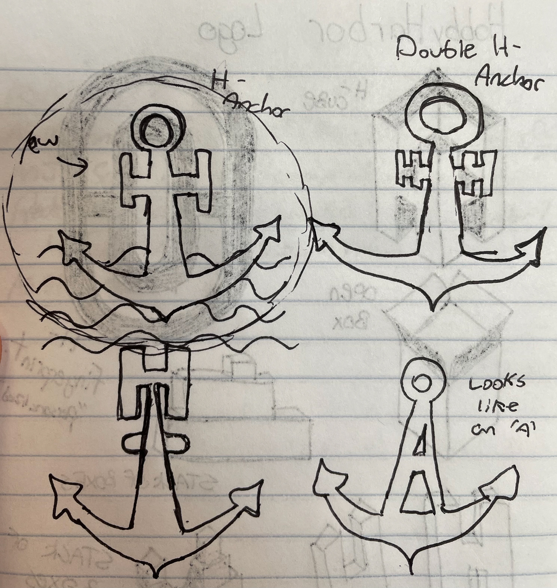
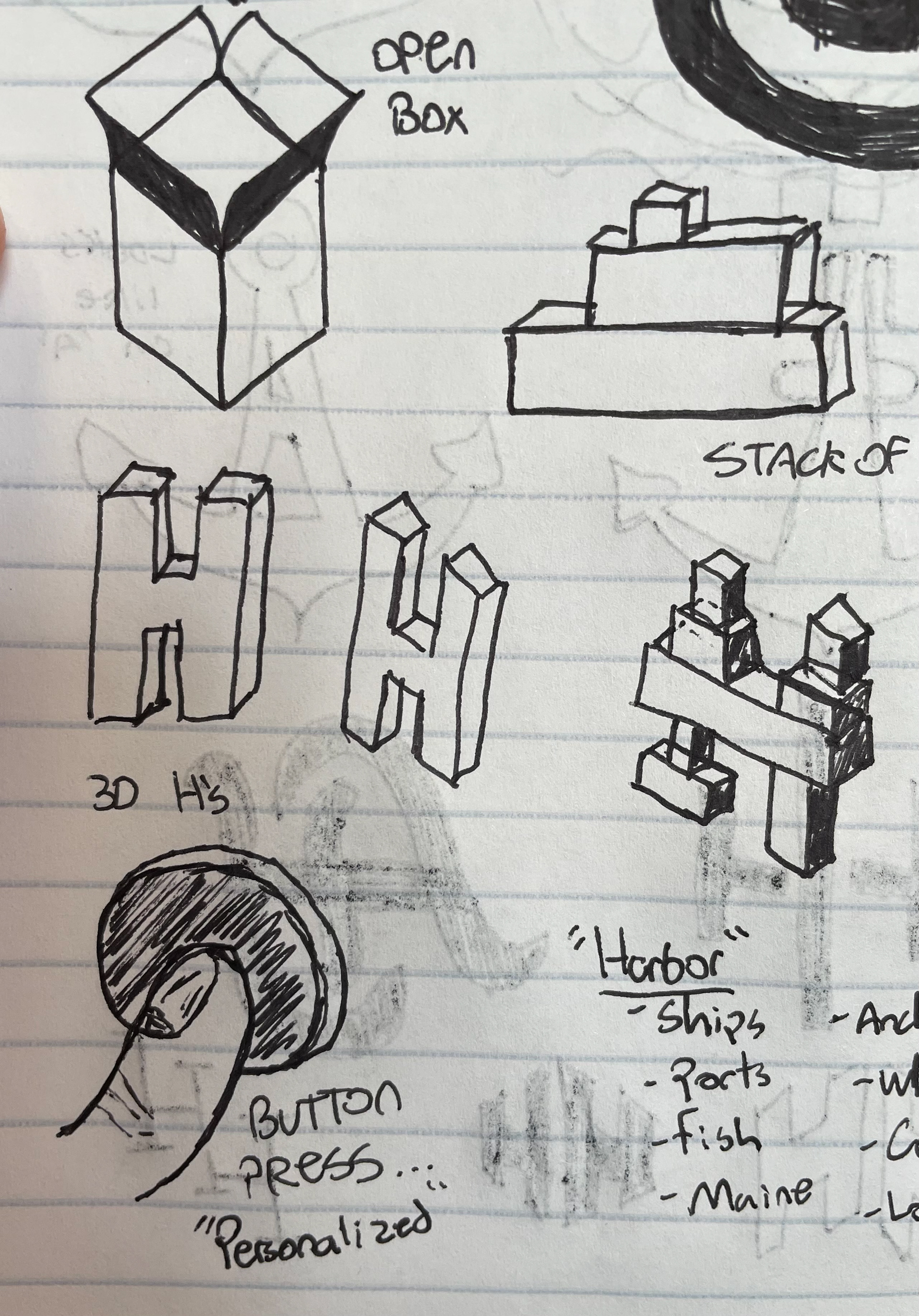
Initial Sketches
Sketches of rough ideas. Prioritized incorporating the alliteration of the brand name.
Final Design
After several iterations, the design, font family, and color palette has been defined.



Brand Guideline
This document thoroughly explains the specific details of the HobbyHarbor brand. Designed in InDesign.
View the short video to get a glimpse through the book.
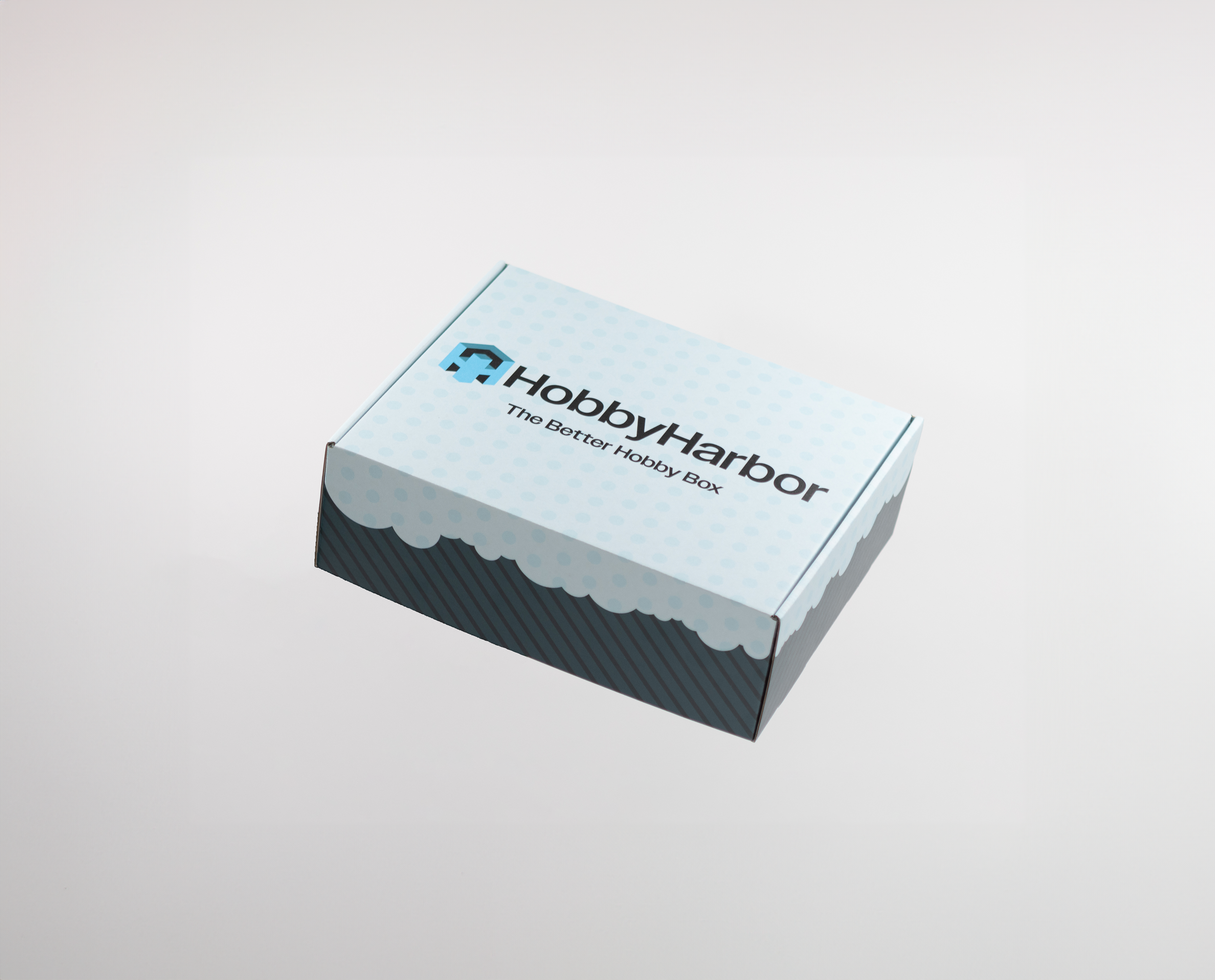
📦Packaging Design
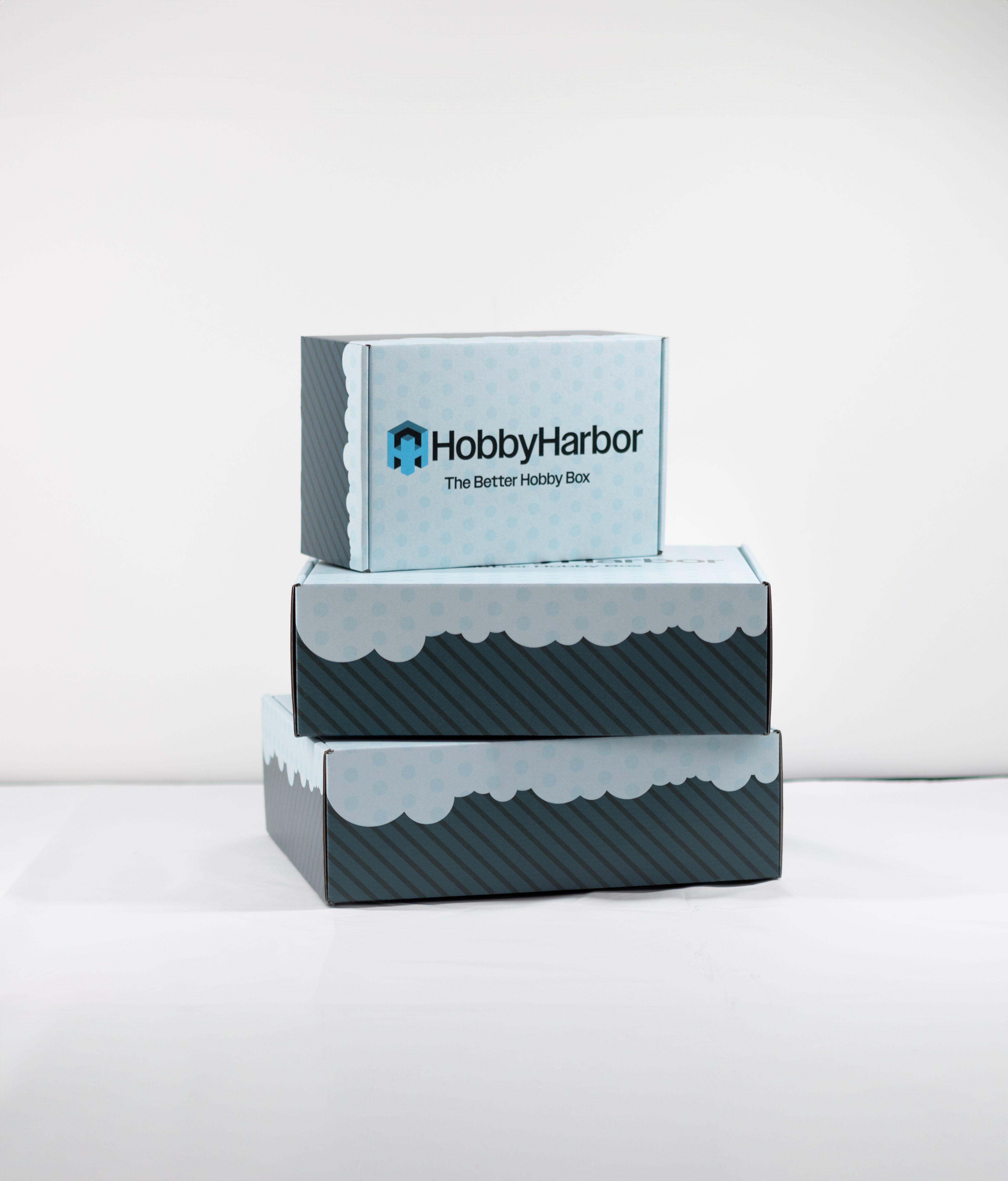
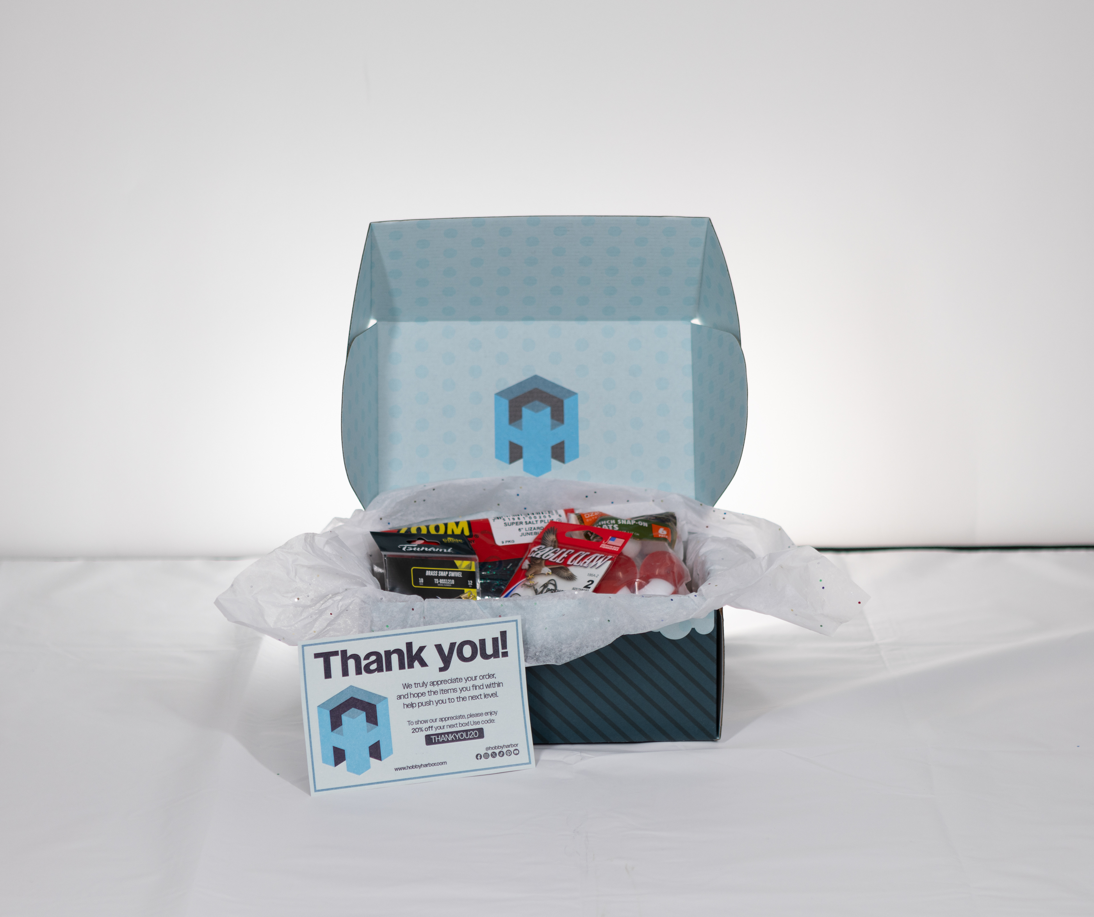
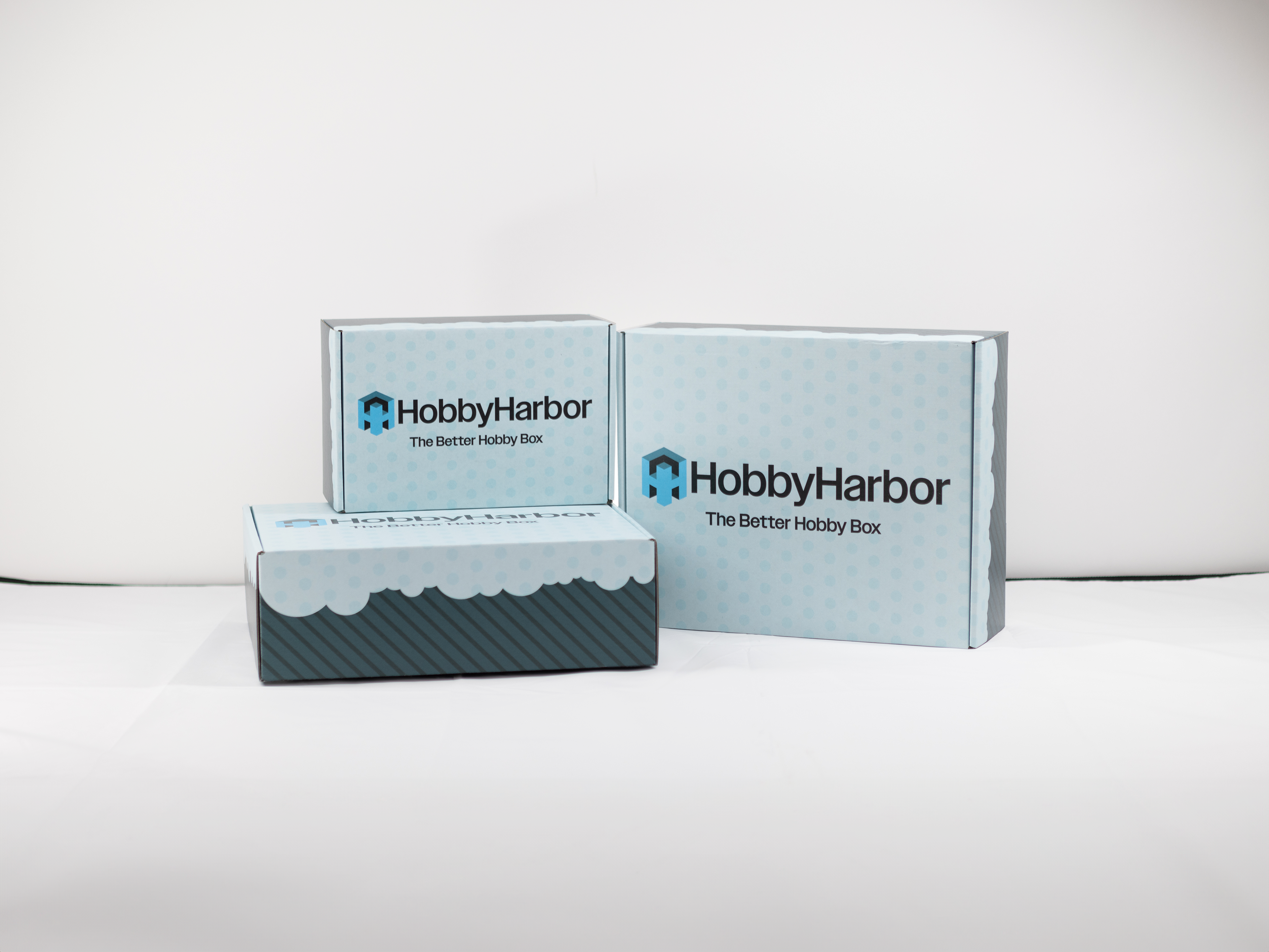
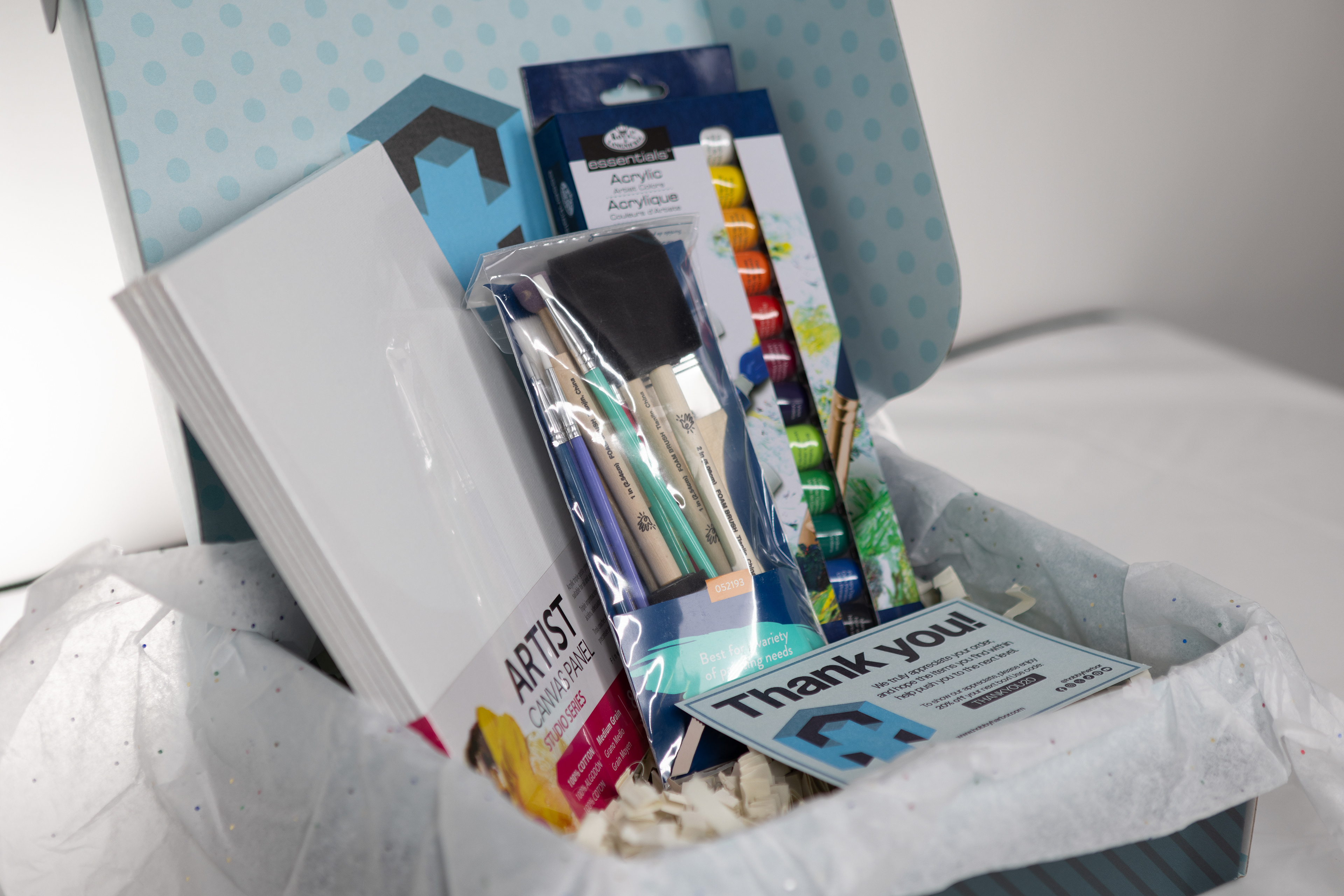
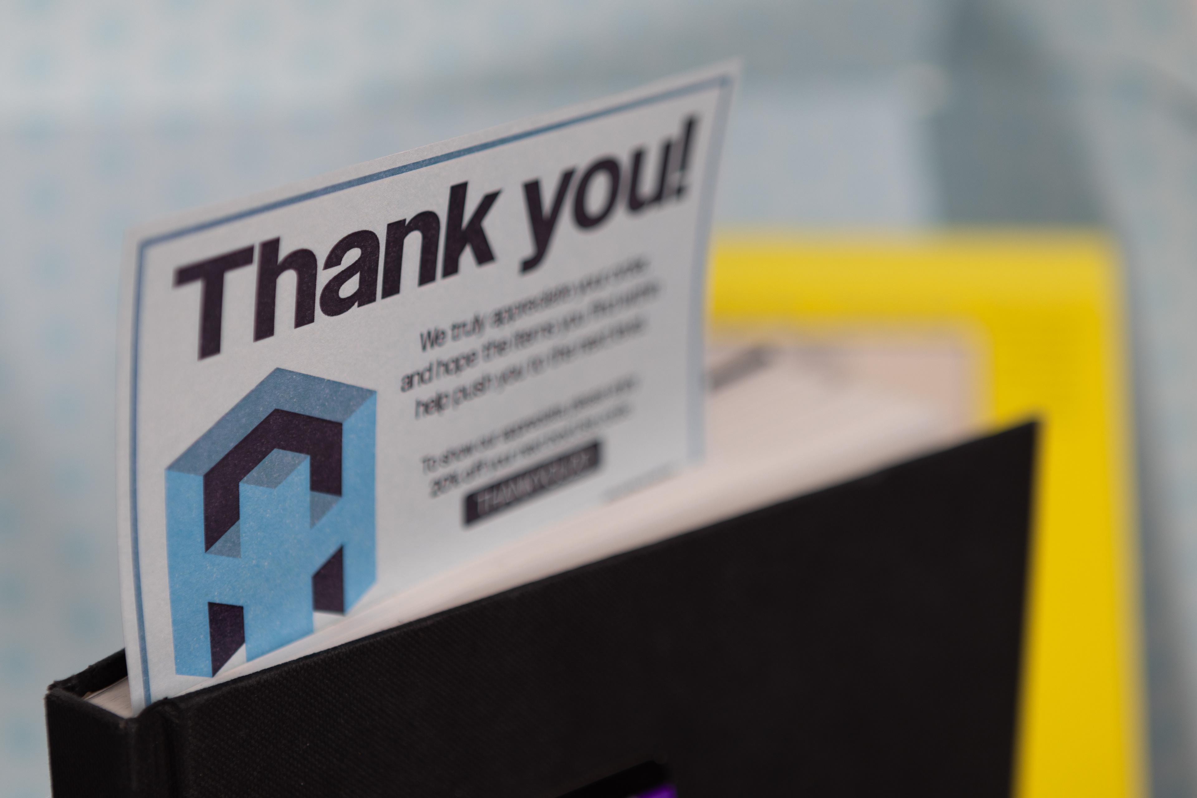
Custom-printed boxes, with specialized thank-you cards, real packaging material and contents create a realistic physical prototype.
👨🏼💻UI Mockups
1️⃣Onboarding
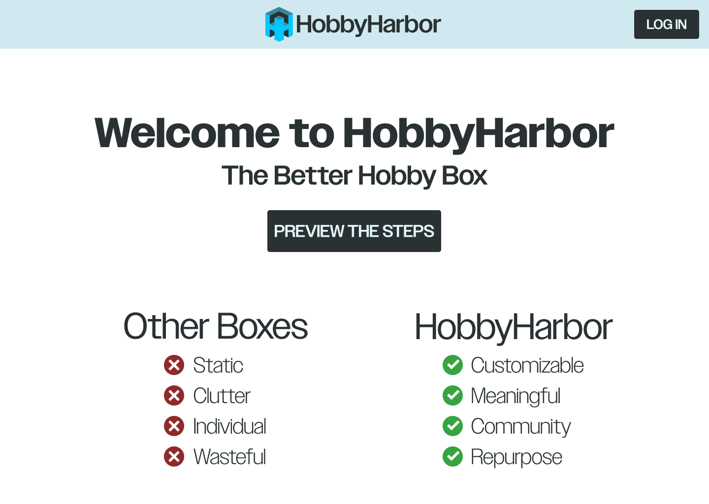
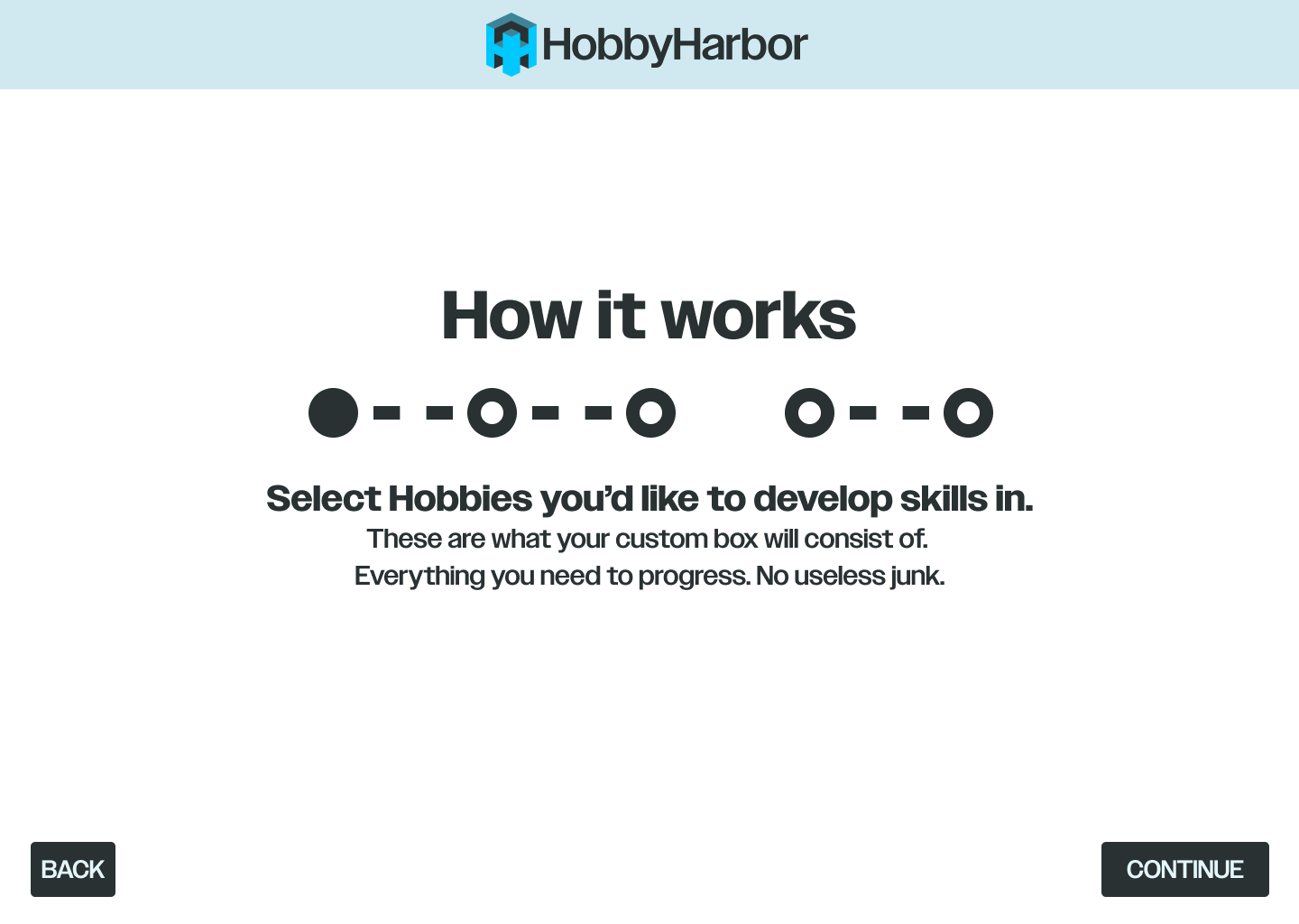
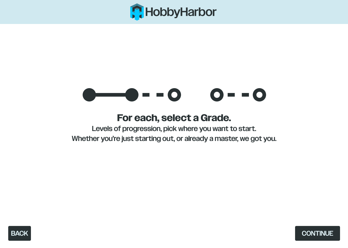
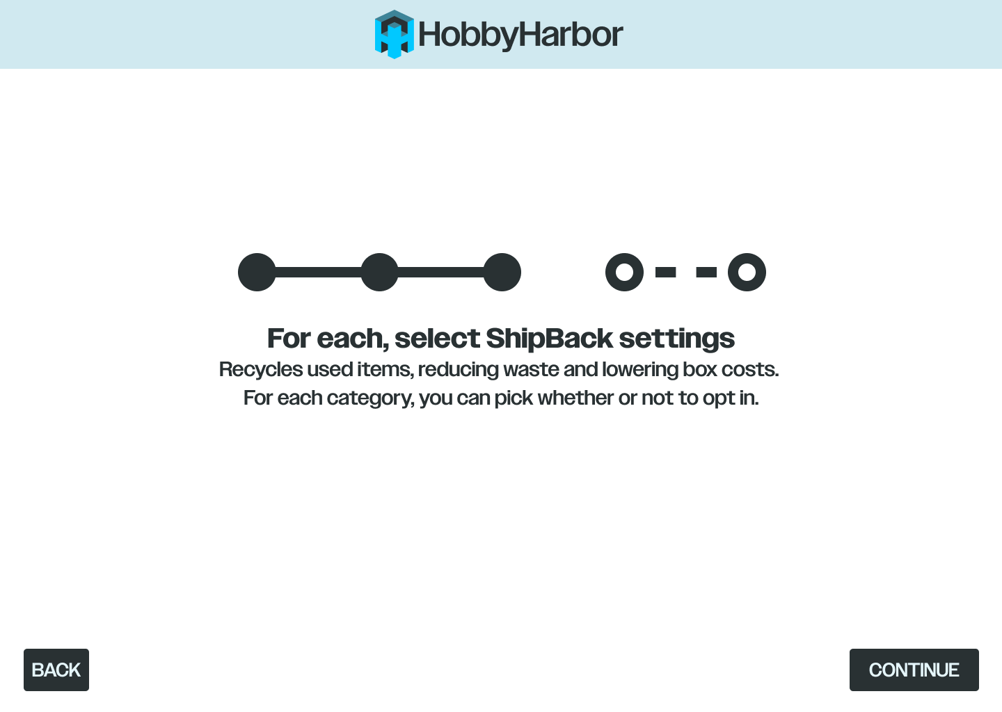
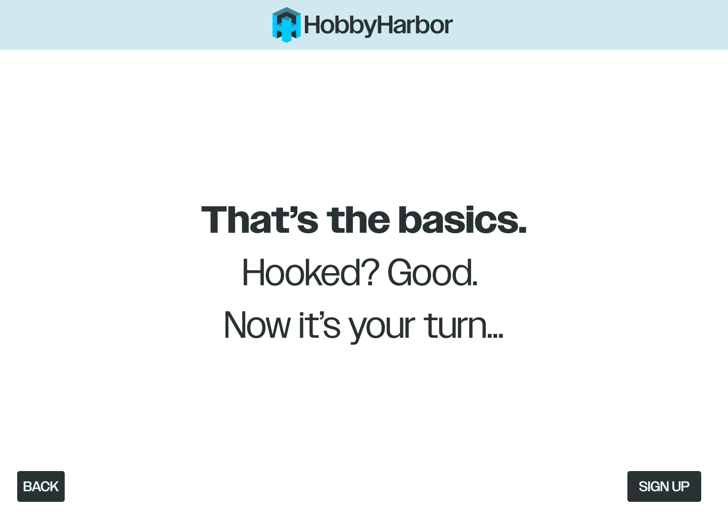
Knowing the steps before making any commitments makes potential users feel more secure - which has been shown to lead to increased conversion.
It may also make them feel obligated to sign up in order to remain consistent, another psychological tactic often seen in platforms with successful UX.
It may also make them feel obligated to sign up in order to remain consistent, another psychological tactic often seen in platforms with successful UX.
2️⃣Signup & Profile
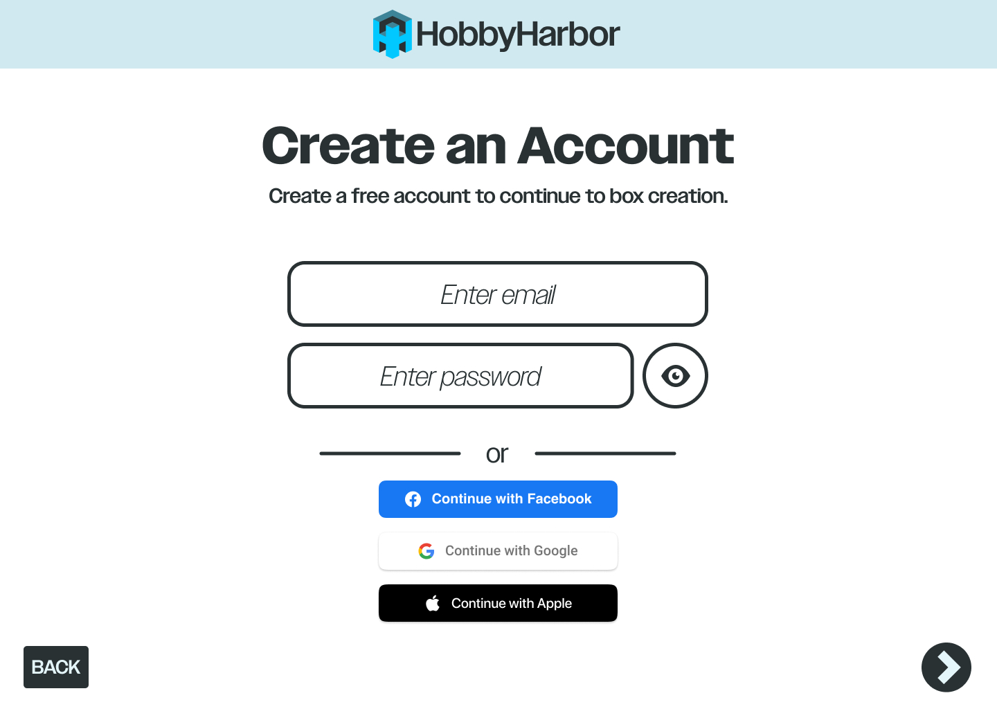
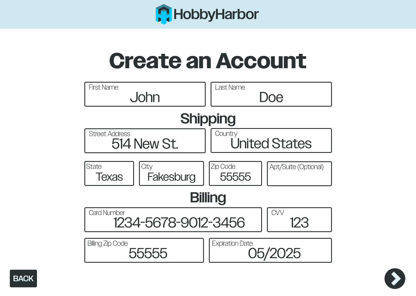
Account creation is an essential step. Providing the ability to sign in with existing social platforms helps expedite the process.
Additionally, the account information gathered here will be used later when placing an order, making the checkout process easier for the user.
Additionally, the account information gathered here will be used later when placing an order, making the checkout process easier for the user.

3️⃣Custom Box Creation
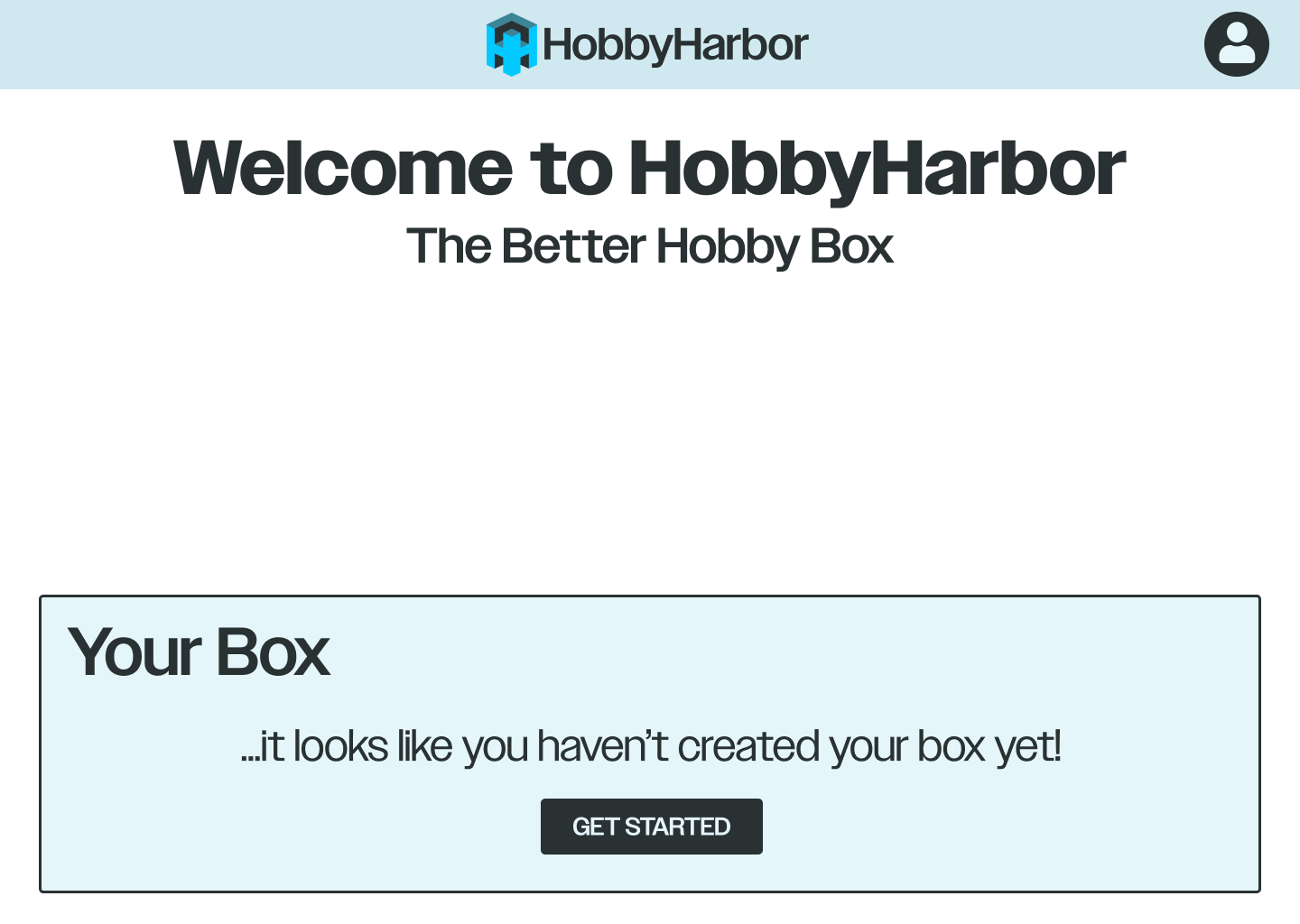
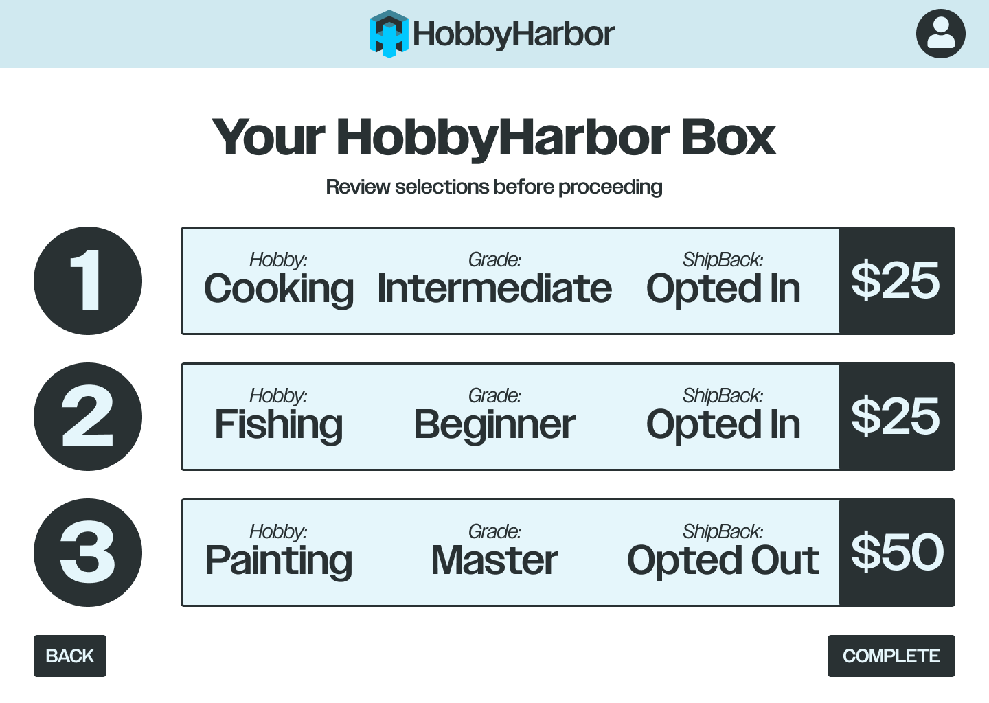
This flow is pretty heavy. Separating the steps into their own screens and providing a progress bar works to keep the user in a positive state of mind, not overworking them.

4️⃣Checkout & ShipBack
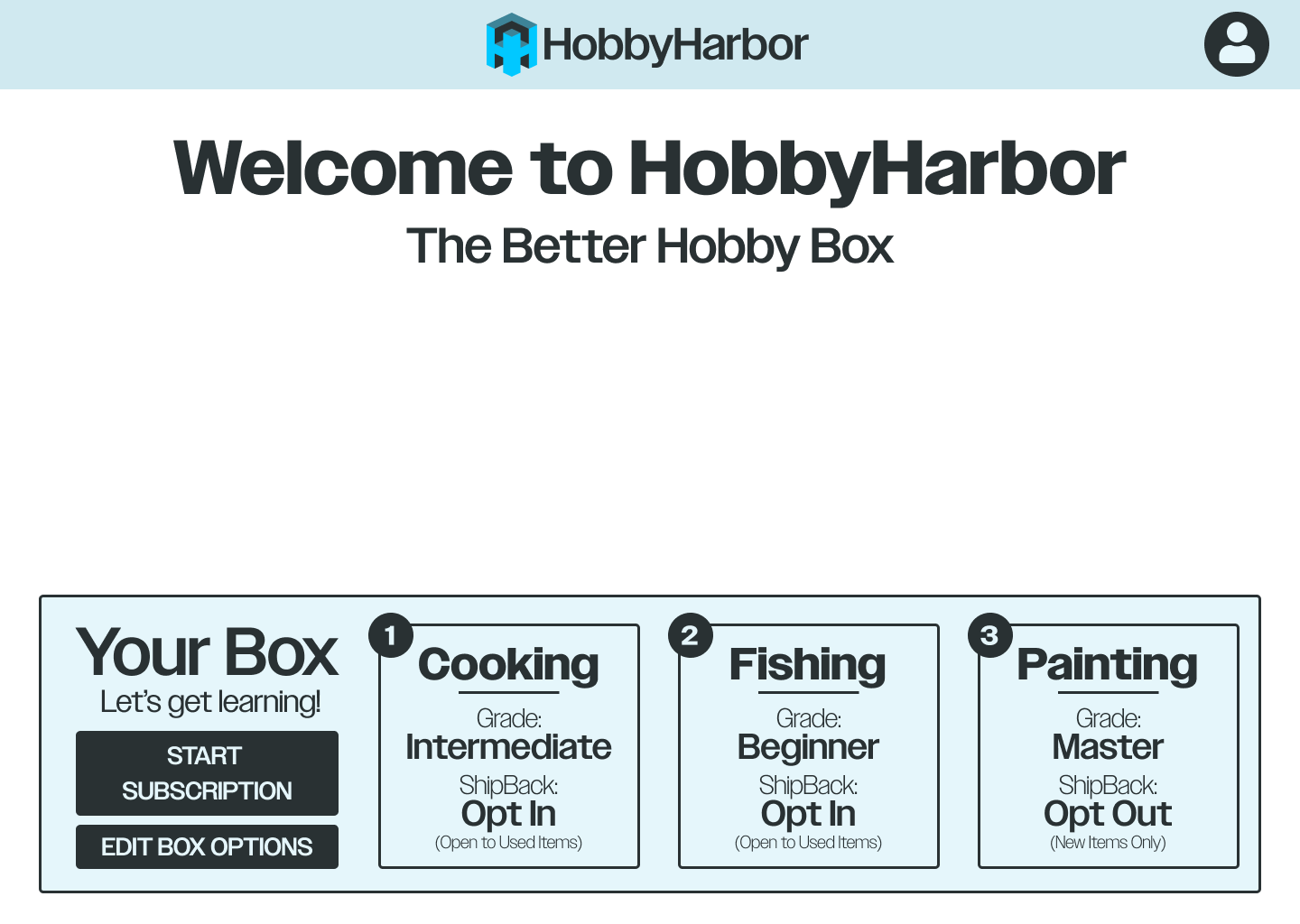
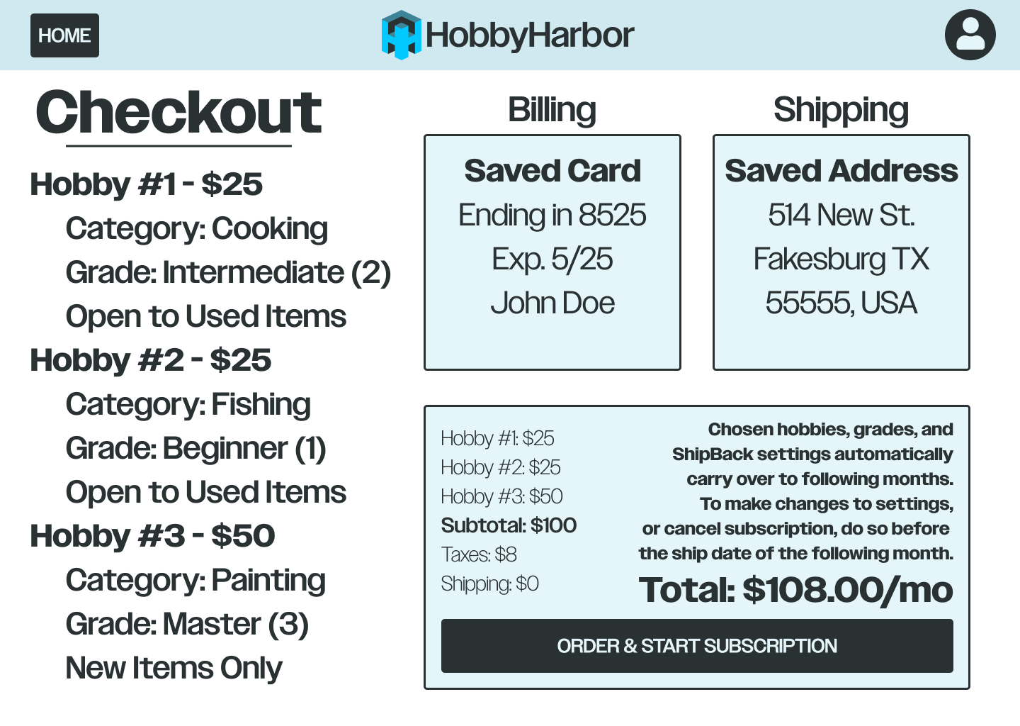
Having the account information saved speeds up this process considerably.
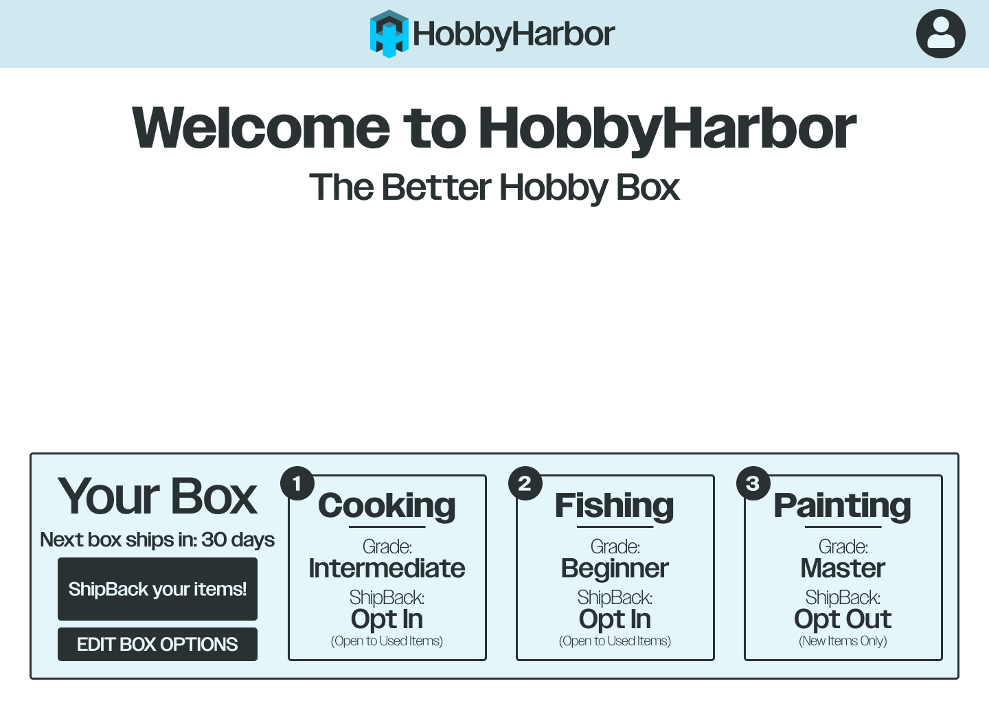
Should the user decide to ShipBack an item, HobbyHarbor will provide a shipping label.
Should the user decide to ShipBack an item, HobbyHarbor will provide a shipping label.
🎞️User Journey Animation
This animation visualizes the entire journey of a HobbyHarbor customer, helping viewers to better understand the problem HobbyHarbor solves, and how it does it.

